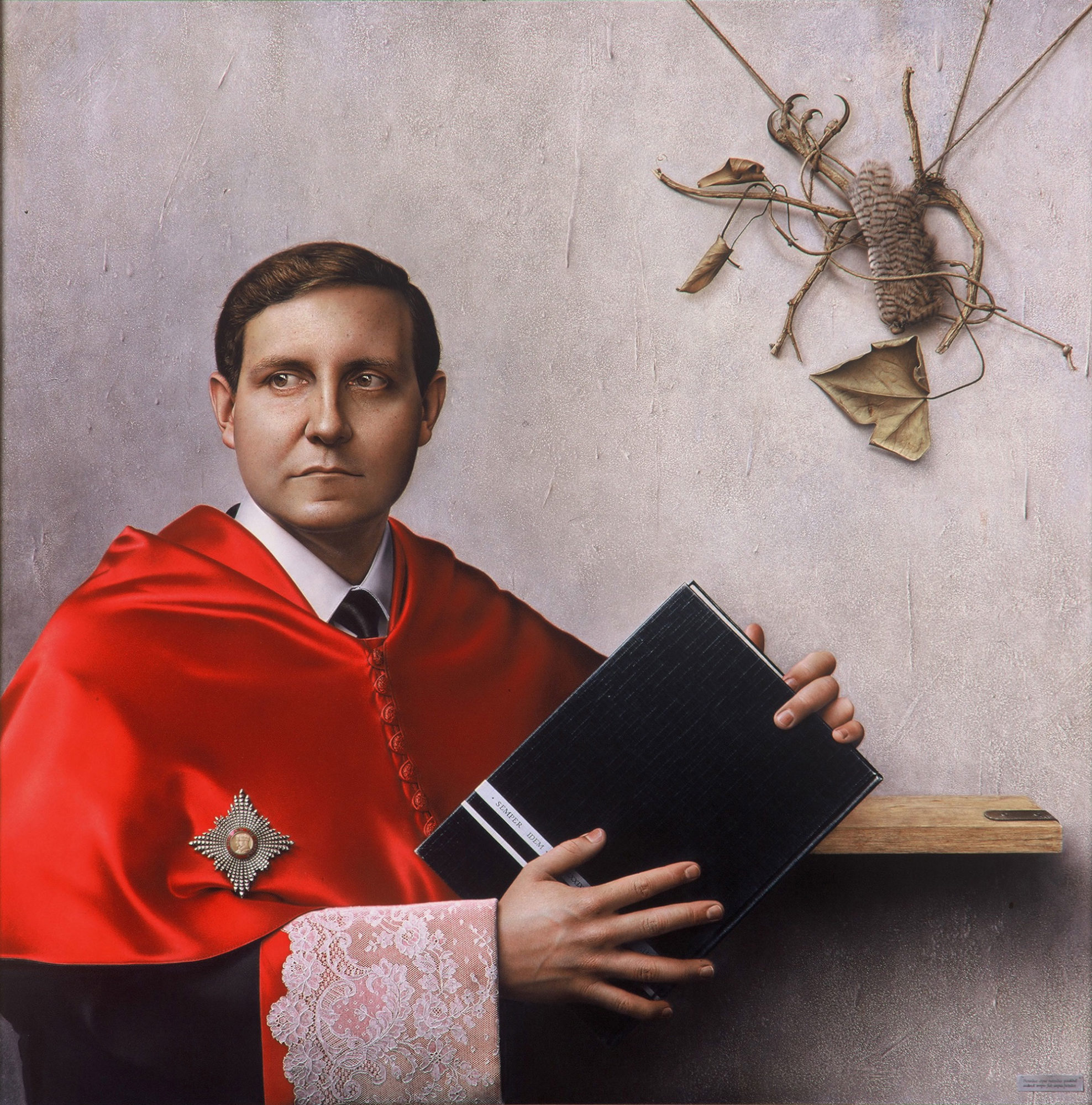
“Retrato de Gustavo Villapalos”
In the “Retrato de Gustavo Villapalos, Decano de la Facultad de Derecho” (1989), efforts have been made to play with more or less evident squares, within a whole which is, in turn, another square. The figure as a whole is inscribed in a first imaginary square: the distance from the left edge of the hair to the right end of the black book is that corresponding to that inscribed diagonally in the square formed by the full format of the picture, so as to coincide with the distance from the middle of the upper half to the right vertical side of the format of the painting. The rest of the contour of the figure would be adjusted approximately to perpendicular lines to that first side of the inscribed square, which would move, leaving the common center, towards the left and down.
Following this logic, the ropes holding the claws of the bird and some leaves in the upper right quadrant match with the third inscribed square (the second would be unused). The square bounded by white bands inside the black book would match with the fourth, while the square formed by the fine Belgian edging cloth would be equivalent to the fifth. Plus, the badge on the chest, the Knight’s Cross of the British Empire granted to the then Rector of the Complutense University, reproduces the square shape repeated throughout the picture, and its center coincides with the diagonal of the main square, the whole format of the painting.
Beyond the greater or lesser success in these games, it seems reasonable to suggest that such reiterations should be subtle enough to go unnoticed, for if they should become evident, they would reduce the sense of naturalness and of unity. Efforts have been made to achieve this by breaking the edges, so that they don’t “abuse” of the memory of a continuous line that would make the square evident, in the case of the human figure and the contour of the claw, and interfering the square of the book with the hand. By matching the edge of the trim with the frame, that fourth side of the square of the sleeve is retracted. Thus, the square shape only appears evident in the cross, but in it, the line of the sides is not a straight line but a concave curve. This, coupled with the abundance of glitter, distracts the viewer from the matrix form. Finally, efforts have been made to add, alongside the variety of sizes already mentioned, alternating colors, tones and textures in the successive squares.
Apart from the inscription on the cross of Knight of the British Empire (“For God and the Empire”), that the portrayed shows on the chest, in the painting we can see other texts of very small size, using small areas of the surface to add friendly details. Thus, in the wider white band of the two that cross the black spine of the book that the dean is holding, which belongs to the notorious collection of art books Noguer-Rizzoli (thoroughly researched in this work), where the name of it appears, it was decided, by mutual agreement, to change this brand for something that could serve as a motto and a reference to the age of the portrayed. Mr. Villapalos chose Semper idem, “always the same”. The age, 41 years old then, appears between his fingers in Roman numerals. Not content with this, it was included in the lower right of the frame, secured to the wall, a cartouche, almost imperceptible, where we can read in Latin, slight but decisively varied, two verses of Martial that, once suitably modified, they note that “It was always characteristic of painters and deans to be daring”, referring to the peculiar painting done for the collection of portraits of deans of the School of Law.
—